Navrang
Re-Branding & Packaging Design
MY ROLE
Research
Visual Design
Packaging Design
TOOLS USED
Adobe Illustrator
Adobe Photoshop
TEAM
Solo
TIMELINE
3 Weeks
BACKGROUND
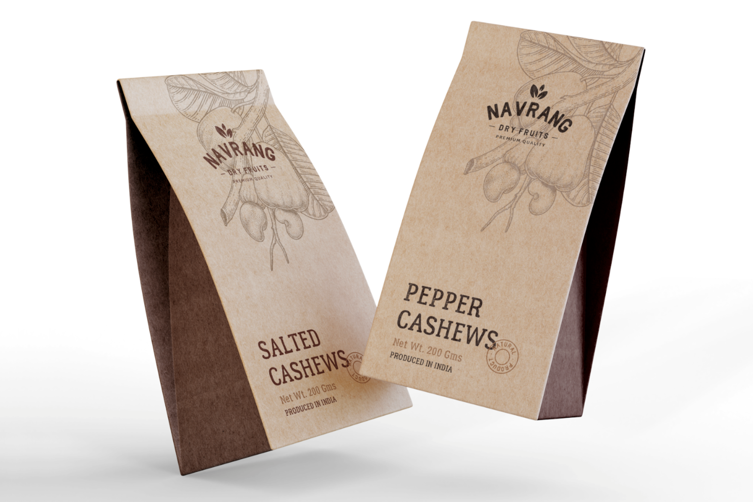
About Navrang
Navrang, a distinguished brand based in Delhi, India, has been a prominent player in the dry fruit market since its establishment in 1975. Specializing in wholesale distribution, Navrang has earned a reputation for providing high-quality dry fruits.
Over the years, Navrang has operated without a defined branding style, relying solely on a logo for brand representation. However, with aspirations to expand into the retail market, Navrang seeks to cater to a niche target audience. As part of this strategic shift, they aim to develop a clean and sophisticated brand identity and packaging that can adapt to their diverse range of dry fruit products.

BACKGROUND
Project Scope
The primary objective of this project is to create a consistent and refined brand identity for Navrang. Previously, their packaging lacked a cohesive and fixed design due to their wholesale operations. To successfully enter the retail market and capture the attention of discerning customers, Navrang requires a visually appealing and versatile packaging design that reflects the premium nature of its dry fruit offerings.
The desired brand identity should strike a balance between traditional and contemporary elements. It should convey Navrang's extensive experience and expertise in the dry fruit industry while projecting a modern and sophisticated image. The packaging design must be adaptable and maintain a cohesive visual appeal across the various dry fruit products in their portfolio.